
It began with a great idea.
“lets do our systems graphs in such a way we can version them in GIT”
Anyway, I believe that is how it started. I was then told that perhaps the open source tool Mermaid would be the solution to that grand idea.
It did look pretty good. I tried using this for some trivial graphs and I was amazed at how well it worked. You could create a small flow chart within a few minutes. Not only that but the graphs that where created were SVG, that wasn’t really on my radar but it would have been useful a few projects back.
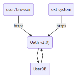
| Version 1 |
|---|
| graph TB AuthServer(“Oath v2.0)”) UserDB AuthServer–>UserDB UserDB –>AuthServer client(user/browser)–https –>AuthServer extpgm(ext system) — https –>AuthServer |
I did like this but to be honest it didn’t really keep the systems properly grouped together. That was also quickly correct by grouping the systems as a sub graph.
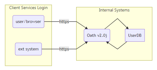
| Version 2 |
|---|
| graph LR subgraph Internal Systems AuthServer(“Oath v2.0)”) UserDB AuthServer–>UserDBUserDB –>AuthServer endsubgraph Client Services Login client(user/browser)–https –>AuthServer extpgm(ext system) — https –>AuthServer end |
Mermaid seemed to handle these flows just fine. Not being content with this I tested the sequence diagrams. They actually seemed to work even easier.
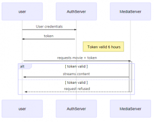
| Sequence Diagram |
|---|
| sequenceDiagram user->>+AuthServer: User credentials AuthServer ->>+ user: token Note right of AuthServer: Token valid 6 hours user->>+MediaServer: requests movie + token alt token valid MediaServer ->>+ user: streams content else token valid MediaServer –>>- user: request refused end |
I was about to bring all of this to my team leaders attention when I received some feedback from one my teammates. He was correct, color makes things not only less boring but can also visually help with grouping like items together.
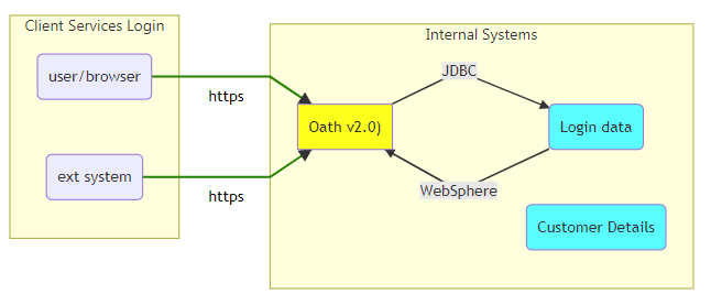
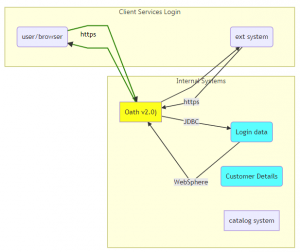
| Version 3 |
|---|
| graph LR classDef cyan fill:cyan classDef yellow fill:yellowsubgraph Internal Systems AuthServer[“Oath v2.0)”] UserDB(Login data) DetailsDB(Customer Details) AuthServer–>|JDBC|UserDB UserDB –>|WebSphere|AuthServerclass AuthServer yellow class UserDB cyan class DetailsDB cyan end subgraph Client Services Login client(user/browser)–https –>AuthServer extpgm(ext system) — https –>AuthServerend linkStyle 2 stroke-width:2px,fill:none,stroke:green; linkStyle 3 stroke-width:2px,fill:none,stroke:green; |
It was at this point that I realized that these connections between elements was only one way. Unfortunately you cannot simply have a line with arrows at each end. I didn’t think that adding a few back arrows would make that big of a change to the diagrams but unfortunately they did. Not only that as you start to add a lot of different elements, each with bi-directional communication, the nicely ordered elements start to change places.
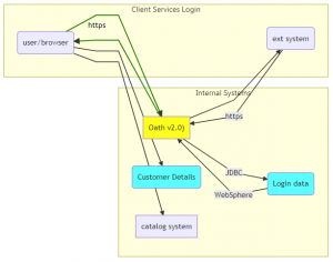
| Version 4 |
|---|
| graph LR classDef cyan fill:cyanclassDef yellow fill:yellow subgraph Internal Systems AuthServer[“Oath v2.0)”] UserDB(Login data) DetailsDB(Customer Details) Presenter[catalog system] AuthServer–>|JDBC|UserDB UserDB –>|WebSphere|AuthServer class AuthServer yellow class UserDB cyan class DetailsDB cyan end subgraph Client Services Login client(user/browser)–https –>AuthServer AuthServer –>clientAuthServer –>extpgm extpgm(ext system) — https –>AuthServerend |
| version 5 |
| graph LR classDef cyan fill:cyan classDef yellow fill:yellow subgraph Internal Systems AuthServer[“Oath v2.0)”] UserDB(Login data) DetailsDB(Customer Details) Presenter[catalog system] AuthServer–>|JDBC|UserDB UserDB –>|WebSphere|AuthServer class AuthServer yellow class UserDB cyan class DetailsDB cyan end subgraph Client Services Login client(user/browser)–https –>AuthServer AuthServer –>client AuthServer –>extpgm extpgm(ext system) — https –>AuthServer end client –>Details DBclient –>Presenter linkStyle 2 stroke-width:2px,fill:none,stroke:green; linkStyle 3 stroke-width:2px,fill:none,stroke:green; |
The colors of the elements remains easy enough, but as the number of elements increases finding and changing the colors of the lines becomes more and more like software development. The hacking kind, not the software engineering kind.
The task that I was given had enough elements on it to take up half of a keyboard but this type of graph doesn’t automatically look very good. It is simply too much.
I did like the few hours that I spent fooling around with Mermaid. I can see how this might be nice if you have some simple elements that should be graphed.
This example exist on Mermaid page
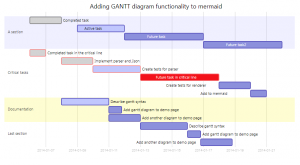
Perhaps Mermaid is an exceptional tool for either sequence diagrams or gantt charts but I don’t really need that at the moment.
If you really want, you can even add Mermaid to your web pages. As for me, I am not certain that I would want the diagrams to be outside of my direct control and at the moment human beings are able to make more of the simplifying decisions for item placement.
I really with I could give this project two thumbs up but I did encounter a few things that would prevent me, certainly in larger sittings, from using this.
- It is not possible to have lines with arrows on each side
- It is not possible to simply add notes or legends to flow charts
- It is snot possible to have a line from one entire subgraph to another item or subgraph
- No influence on the element placement
- SVG output from the tool isn’t well supported by Microsoft products, or else there is a problem with the SVG image.